Wikitude 4 For The Android With Video
When I first heard about Wikitude on the Android device I had a problem. Do I buy an Android or an iPhone? It was a hearty decision that took me a month or more to make. In the end, I opted for an iPhone as there were more augmented reality applications available. Shortly after both Wikitude and Layar made an appearance on the iPhone so my decision felt justified.
Wikitude and Layar Testing

Since then I have done several head-to-head challenges taking both Wikitude and Layar for test drives in London to find either restaurants or famous landmarks and Wikitude always comes out on or around the top. Indeed in the recent Augmented Planet Readers, Choice Awards Wikitude was voted browser of the year by you guys so they have been doing something right.
While I have a soft spot for Wikitude, one of its weaknesses was the fact that you could only search on Wikipedia, Qype, or their Wikitude. me service.
Wikitude is a service where you can add your own points of interest via the website and have your content appear in the camera view for all users. Layar, on the other hand, has an open API where developers can build their own POIs and as such have over 300 layers available making it much richer. For example, you can use Layar to search for nearby Twitter users.
Wikitude 4 On Android
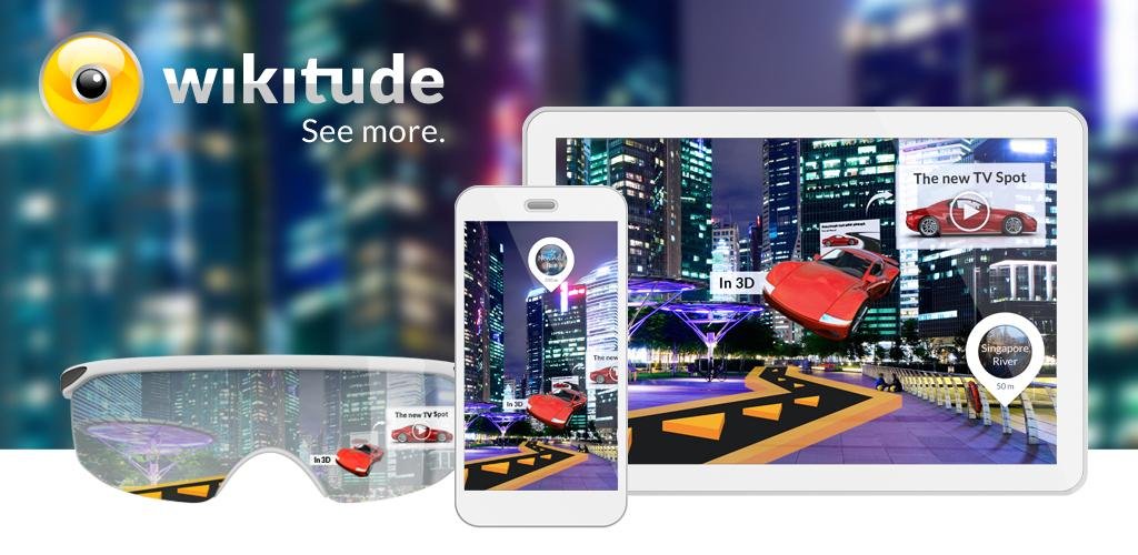
Wikitude 4 has hit Android and has numerous improvements. Firstly Wikitude 4 supports miles as well as kilometres so no more wondering if 7.5km is too far to walk. I’m really happy about this change and I’m glad my nagging has paid off.
Wikitude 4 also boasts many new features and a UI refresh which looks really cool, they have obviously put a lot of effort into the update and it shows. Version 4 supports ‘overlays’ which are POIs either produced by Mobility themselves or by 3rd parties (think Layers if you’re a Layar user).
Yes, developers and content providers are now able to create content to be included which is no doubt going to see an explosion of the number of search categories available in the future. Everything from the nearest cinema, and what’s showing to the location of where to buy the latest gadgets.
The current list of ‘overlays’ include: Youtube, Google Local Search, Twitter, Booking.com or Panoramio
UI’s new look and feel
Unlike Layar (the current version at least) which allows you to search only on one layer at a time, the Wikitude developers have kept with the approach of allowing users to search over multiple sources.
In previous head to heads challenges, I have run you will have seen that just because a famous POI shows up in one data source there is no guarantee that it will show up in another. With Layar, it’s a constant juggle between the various layers to ensure that you capture everything.
Wikitude still allows you to search across all relevant sources so there is less chance of you missing a result. This leads to another nice improvement over the previous version. In version 3 all your search results had the same icon in the camera view so you couldn’t tell whether that result was from Wikipedia, Qype, or wherever.
Version 4 addresses this by giving each overlay its own icon so you’ll know exactly which data source has found the result. Potentially this could be a problem with having too many search results shown in the camera view making it impossible to read, but the Wikitude developers are ahead of the game and have included an option to limit the number of results which will help reduce the clutter.
Wikitude 4 for iPhone Users
As I said at the start, I opted to buy an iPhone and version 4 of Wikitude is currently only available for Android so I’ll have to wait until version 4 hits the AppStore, but if it looks anything like the Android version I’m sure it will be a huge success. In the meantime take a look at the video below that has more details on some of the new Wikitude 4 augmented reality browser features.
